Blog What are affordances, and why do they matter?
Affordances are characteristics that suggest interactivity. They provide hints that help users to understand your UI faster.
One of our favourite mantras in interface design has always been “Don’t make me think”.
Steve Krug coined this term in his spectacular book of the same name. It means there should never be any doubt about how something works. As designers, our goal is to make things immediately clear. Users should take one look at our screens and ‘get it’.
After all, nobody wants to puzzle over things. Steve says it best with “as a user, I should never have to devote a millisecond of thought to whether things are clickable or not”.
Good advice, that.
So how do we avoid making the user think? There are several considerations, but a big one is how we use affordances in our interfaces.
What are affordances?
Affordances are visual clues in the design. They imply how users should interact with something.
When it comes to everyday life, affordances are everywhere. They’re one of the main differentiators between well designed products and bad ones. For example, take the humble door.
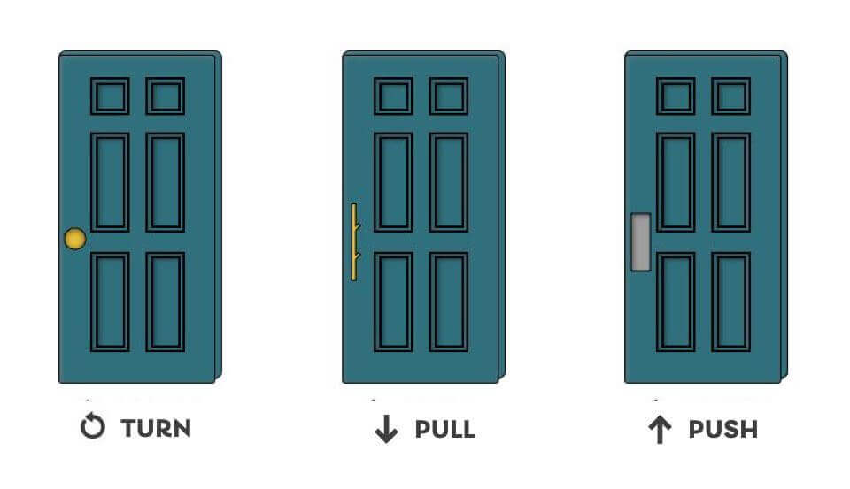
If a door has a handle that sticks out, that’s an affordance. It’s suggesting that you need to pull, and not push.
Go one step further, and think about the handle itself. A circular door knob implies a turning motion. A raised & straight bar implies grasping, and pulling away.
Affordances can be more subtle, too. A door with a metal plate on one side affords you to push it. There’s nothing to grasp, so the action to push becomes the logical assumption.
Ever slammed face-first into a door, trying to push when you should have pulled? That was probably due to bad affordances. The way things look should suggest how they work. It’s a pillar of good interface design.
Examples of affordances in digital UI
It’s not only in doors that affordances matter.They’re equally applicable to the design of digital UI. It all comes back to making things obvious.
Affordances make the ‘interactive stuff’ easier to pick out. They give the users clues about how they should interact… And what will happen when they do. Here are just a few examples of affordances in UI design.
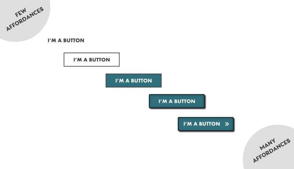
Contrast & depth in buttons
Clever use of contrast, borders and shadows can make buttons feel raised. It gives them the impression of being pushable, just like a real life button.
This is known as ‘skeuomorphic’ design. Adapting the visual qualities of something psychical into a digital interface.It creates an expectation by drawing on a user’s past experiences with a physical thing.
Skeuomorphic design doesn’t suit every design. In a world of minimalist branding and ‘flat design’, it can seem garish. Luckily, we don’t always need to go so far to create decent affordances. Using an interesting shape or a high contrast colour can be enough.
Design choices should be in-keeping the wider look-and-feel. The more ‘noisy’ your user interface, the more prominent you’ll need to be with your affordances.
If your site design is fairly minimal, then you don’t need to put borders and drop-shadows on everything. The important point is that buttons look clickable.
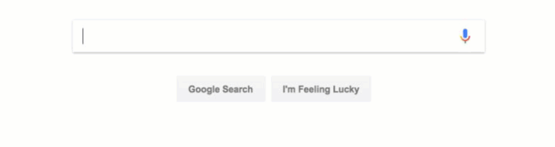
Visible ‘focus’ on a text inputs
Focus refers to which element on the screen is currently receiving input from the user. To show focus on text inputs, most applications show a black flashing line. This is sometimes called the ‘text cursor’. The field itself might also be highlighted in some way.
These characteristics all draw the user’s attention. They hint at interaction.
Search engines like Google will automatically put focus on the search bar. Login or registration forms will do the same on the first field, such as ‘username’. When the user sees this, they know they’re supposed to start typing.
Clear, visible focus helps people know that they’re ready to type. It encourages action.
Iconography for navigation
Pictures tell a thousand words. Using clear icons can help convey a link’s purpose, and reinforce what something does.
Once again, past experiences are important here. Functions and features that are common across websites and apps have become universally associated with certain icons. Think ‘save’, ‘undo’ or ‘refresh’. Make sure you’re mindful of this when selecting a visual language for your navigation.
Hover states
Hover states are a staple of interactivity on desktop devices. When moving the mouse cursor over an element, we change the visual state. This tells the user that clicking will do something. Changing the mouse pointer itself is also a common affordance. It suggests that something is interactive.
A quick warning on hover states. Whilst they’re super useful on desktop devices, touch-screens don’t support them. Neither do many assistive technologies.
Hover states can add clarity, but they should never be used as the sole way to communicate information.
Avoiding “false affordances”
When used well, affordances can improve the clarity of your interface. When used badly, they’re a usability issue waiting to happen.
False affordances are pretty self-explanatory. The design sets an expectation, but then ends up doing something very different.
Let’s revisit our door example. We’ve all experienced the irritation of pulling a door handle that actually wanted to be pushed. That pesky, misplaced handle created a false affordance. Experience trains us to see a handle and pull it. But when the reality doesn’t match our expectations, it’s annoying. We feel tricked.
Users make assumptions when an interface looks like something they’ve used before.
This is a powerful habit. It’s why UX designers need to stay on top of patterns & trends. UI design is a field chock-full of best practices, and you need to understand them. Users are conditioned to expect a certain set of rules, based on how UI control is styled. People may not be consciously aware of it, but it’s true.
When we make something look familiar we set an expectation. If we do something totally differently to the rest of the internet, It can be really confusing.
Don’t make them think!
In a nutshell, align your interface to what users expect.
- Make interactive elements stand out.
- Make important controls obvious.
- Stick to established design conventions & patterns.
- Your interface should never leave the user guessing.
Utilise affordances wisely, and don’t make your users think!

Chris Myhill
— Co-Founder