Blog The benefits of a content-first approach
By using real content in the early stages of design, we can ensure the right messages are delivered at the right times.
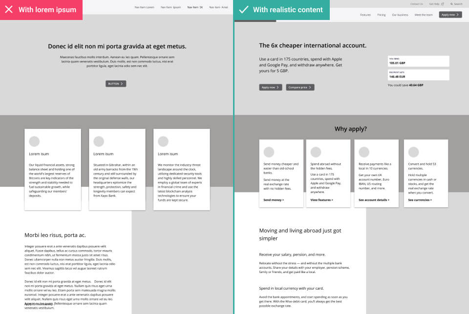
If you’re familiar with the design process, then you’ll also be familiar with a little thing called lorem ipsum. Lorem Ipsum is basically a load of gibberish latin. It’s used by designers and marketers as placeholder text, until the actual copy is created. We use lorem ipsum to fill our mockups with words, and have them look right in the absence of agreed text.
It has always been common to see web designs and prototypes full of lorem ipsum. In fact, it’s considered fairly normal for project teams to review and approve designs before any of this dummy text is replaced with real content.
Although it’s a common practice, this is also a dangerous thing to do.
The dangers of designing without content
Lorem Ipsum can be a valuable tool for experimenting with different concepts and ideas in the early stages of wireframing and style development. But doing too much design without using realistic content can have negative consequences.
- The format or structure may be different than expected. Something we’d designed as a paragraph could end up being supplied as a list of bullet points. Or perhaps something we’d designed as an infographic is actually more of a long-form article.
- The content may be more nuanced than expected. Our layout may not accommodate for unknown parts of the content that need to be visually distinct from one-another. For example, there could be a certain stat or phrase in the final copy that needs to be made super prominent. If we don’t know what this is, we can’t design for it.
- The content may be much longer/shorter than expected. Something we’d expected to be a whole page of text in our design may only end up as a single sentence. That’s far too short to warrant its own page, and means we have to revisit the site structure and navigation.
- Our design can’t tell a story if we don’t have content. Not knowing the specific messages our design is supposed to communicate prevents us from being able to think about visual storytelling. For example, we can’t pair text with suitable images or graphics if we don’t know what it’s going to say.
As you can see, content is intrinsic to design. If content is provided too late in the process, it can often be incompatible with what we’ve created. It will mean added time and expense to go back and rework things. It could also result in a sub-par execution than if content had been considered earlier.

Designing with content in the early stages
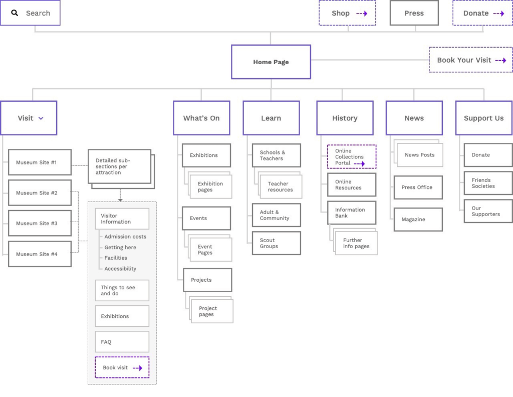
To avoid these pitfalls we need to start talking about content in the earliest possible stages. And yes, it’s possible to put content at the heart of our process before even starting on design layouts. We do this by focusing early discussions around the information architecture.
When we talk about information architecture (IA for short), we’re talking about how we structure the information on our site. It’s the planning of how users will move between the site’s various content pages and features.
By mapping out the structure of our website first, we can raise (and answer) some broader questions about our content such as :
- Which questions does our content seek to answer?
- What are the most (and least) important content topics?
- How will this information be grouped?
- How many pages will our website have?
- How much of this information already exists, and how much needs writing?
This step is hugely beneficial because it helps stakeholders to understand the user journey. Planning the information architecture in the first stages also kicks off the content creation process, by allowing copywriters to understand which pages they are writing for.

Progressing visuals without content
We’d love to start every web design project with final content ready and waiting. Even having a first draft that gives us a good enough idea of messaging, formats and lengths will go a long way towards creating more realistic designs. But that’s not always realistic. It’s sometimes necessary to make progress in the absence of any draft copy at all.
The good news is that we can still move forward with certain activities.
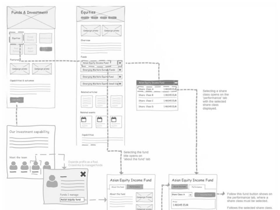
We can start by planning the user journey using low-fidelity wireframes. During this stage, it’s totally fine to use lorem ipsum. That’s because in these sketchy layouts, we’re much more focused on the movement between sections rather than detailed presentation of content. We don’t need the actual text for this. All we need is a rough idea of what goes in each section, which ought to have been identified in our information architecture.

Then there’s the more aesthetic elements of our design. How do we start developing the look-and-feel, before we get content? To progress the more stylistic elements of our design we use style tiles. Style tiles are loose mock-ups that show the relationship between key aesthetic elements like colours, typography, buttons and some elements of the layout.
A style tile doesn’t fully define the finished layout. Instead, the designer is free to experiment with several ideas to present to the client, opening the floor to discuss styling without getting tangled up in the detail of content.
![]()
As we gradually enhance the fidelity of the designs, we should begin incorporating more realistic copy when it becomes available. It’s okay to work with early or incomplete drafts in these first versions of a design. We quite often see content and design developed in parallel. That’s because it can be helpful for copywriters to refine their text when it can be previewed realistically in the website mock-up.
Testing designs with real content
I don’t think anyone needs reminding of how important user testing is. Without testing, the usability of a design is uncertain, and so are the assumptions about how people will use it.
We can only learn so much by testing a design full of lorem ipsum. No matter how pretty the designs, the content will make or break the user experience. Even if the design gets an amazing reception in user testing, it could still fail if the final words are confusing.
We once worked on a project for a large UK retailer, creating a self-service system for health and wellness. The idea was that employees suffering from health complaints could come to the system, describe the problem, and then see what kind support the business could give them.
Rather than showing all possible health issues in one great big list, our solution was to help employees diagnose themselves. The site presented users with a series of questions, asked one at a time. Based on the answers we displayed the resource the person would need.
The content team worked closely with us during the design process. This was great, as it meant we had realistic content in the first version of our prototype. And it’s a good thing we did.
When we tested this prototype with users, we uncovered some serious usability issues relating specifically to the content. The design didn’t fail due to bad UI or the user journey being wrong. It failed because users didn’t understand the questions they were being asked. We’d over complicated our language, using too many complex or technical terms. This led to users getting confused, and picking the incorrect options for their needs.
![]()
We’d never have been able to identify this if we hadn’t tested the designs with real content.
Thankfully, we were able to resolve these issues in the next design iteration by simplifying the questions, and rewriting the text in a more user friendly way. Although this all felt like a no-brainer in hindsight, we didn’t realise it before testing. Without the insight we gained from testing our content, we’d have released a problematic system that would have confused a lot of people.
Take a content-first approach
When it comes to text in our designs, it’s okay to use a degree of lorem ipsum text in the low-fidelity wireframes and style tiles. But as we move into the more detailed stages of interface design, we should be using real content in our layouts – and testing them, too.
The further along we are, the more important content becomes. Make sure you’re prioritising it in your design process, if you’re looking to make a great user experience.
Chris Myhill
— Co-Founder