Blog Designing the perfect landing page
One of the most important roles of your website is to turn first-time visitors into loyal customers. Landing pages play a massive part in this.
You never get a second chance at a first impression. When new visitors arrive, we’ve got to quickly convince them that we can solve their problem.
This is the purpose of the ‘landing page’.
In this post we’re going to venture slightly into the world of online marketing. But don’t worry! Before we’re cast into a sea of jargon and lingo, let’s equip ourselves with some definitions:
- Landing Page: A destination page that’s geared towards being the first thing that a user sees. These are often focused around specific campaigns or products. They’re likely to be where most of your search engine efforts and paid advertising are directed.
- Conversion: A fancy way of saying the ‘the thing that we want visitors to do’. A conversion can be anything. Purchasing a product, signing up to a form or downloading your app are all possible examples.
- Bounce: A visitor who arrives on the site, but then immediately ‘bounces off’ rather than continuing to view other pages. Users who find the site on google, but then hit the back button are classified as bounces.
- Call to action: A button or link that grabs the user’s attention. These actions are generally linked to a conversion, like a ‘buy it now’ button.
Right, that’s our translations covered. Let’s talk about landing pages.
Why landing page design matters
Landing pages are often thought of as a marketer’s problem, but they actually have many UX challenges too. They’re all about orienting a new user.
A good landing page helps them to quickly answer some important questions about your website:
- What can this website offer me?
- Why should I use your product / service?
- What should I do next?
When it comes to landing pages you should adopt a ‘5 second rule’. This assumes that any visitor who discovers the page will decide in 5 seconds if it’s right for them.
As I’m sure you’re aware, five seconds really isn’t much time. Your landing page will be taken at face value, so design is a big consideration here. Make a good first impression, and the visitor is likely to convert. Make a poor one, and they’re probably going to bounce off your site and try something else.
Fortunately for us, the business-critical nature of landing pages means they’re one of the most frequently tested areas of web design. From all of the testing that’s been published from around the industry, a number of best practices have emerged.
Before we go any further, a quick heads up. Best practices are useful, but nothing is better than doing your own testing. This guidance should give you a good place to start though.
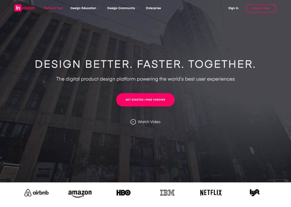
Provide a clear call to action
All landing pages have one main goal. We want visitors to do the thing that’s most desirable to the business.
This desired behaviour should be reflected in our call to action. It should be the most visually distinct part of the page. Whether it’s a form, a button or an information callout, it needs to be the highest contrast element.
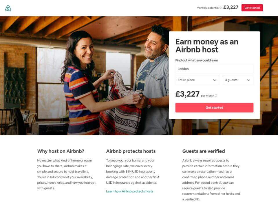
It’s very important that there’s only one primary call to action. It’s possible that you might want to put some secondary actions on the page too, but the ‘secondary’ nature of these should be reflected in their visual prominence on the page.
It’s always good to have prepared a secondary display style for less important actions, so that they’re not competing for the user’s attention.
Prioritisation for your primary action can be tricky, but it’s absolutely necessary to keep your landing page focused. Try holding a workshop to get your stakeholders coordinated on the most important user actions. Write them all out on sticky notes and play a game of higher-or-lower. It’s a simple technique, but effective at getting everyone aligned.
Use photography wisely
High resolution photography is readily accessible to most businesses these days, stock or otherwise.
Fast internet connectivity is more accessible than ever, particularly on mobile. This is really advantageous when we design landing pages with impactful photography. A good photograph can inspire people, and get them excited about the product or service.
That said, you need to be careful.
As speedy as connections have become, bandwidth can still be an issue. Images will generally be the main contributor to your page’s load time. Calling back to our ‘five second rule’, if two of those seconds are spent loading big images or videos then you’re off to a pretty bad start.
The specific choice of image can also have a surprisingly big impact on your conversion rate. Your images need to resonate with your target audience.
If you’re using photos of people in your photography, make sure they relate to your audience. If you have user personas, this is a great time to refer back to them, making sure you’re reflecting those kinds of people in your photography.
You also want to avoid images that look too blatantly stock or false.
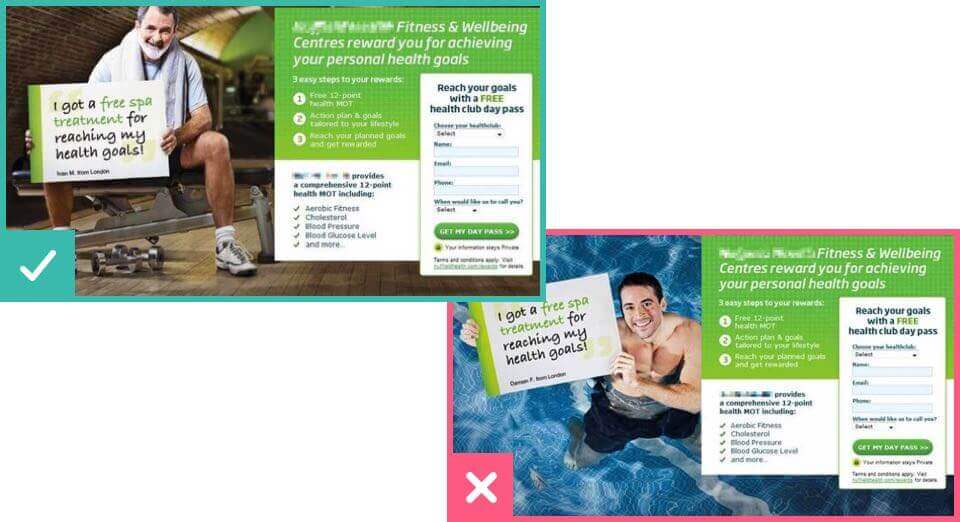
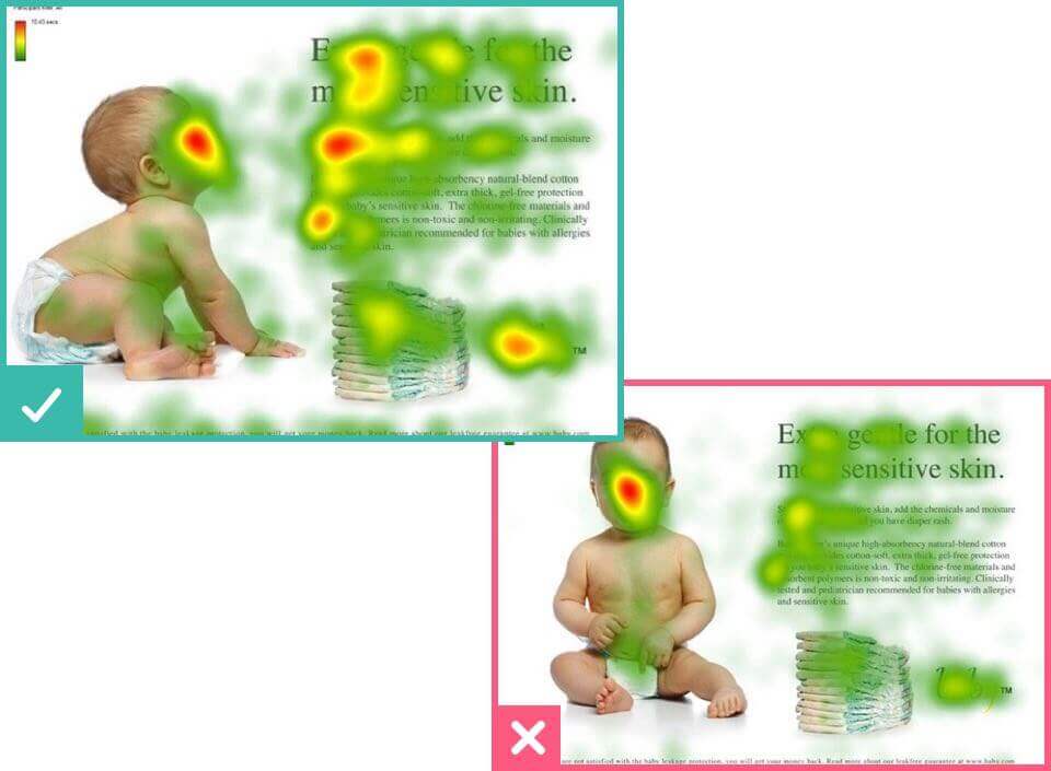
The focus-area of the image is important, too.
You’ll want to make sure that the photo draws the user’s attention to the call to action, and not away from it. Eye tracking research has shown that people are more likely to read an advertisement if models are looking or gesturing towards the text.
Cut out the distractions
If there are too many things are competing for the user’s attention, they’re likely to get overwhelmed. Remember, the most important thing on the page needs to be that primary call to action. Every other message, offer or promotion is distracting the user from what you really want them to do. Making information clear helps visitors to quickly make a decision.
Having multiple messages on the page is often unavoidable. In these cases, it’s important to set out a clear visual order of your information. Make it obvious what visitors are supposed to look at first. Generally, this should be your call to action.
People do scroll on the web, assuming you give them the right visual prompts. So embrace the medium, and use plenty of white space to break these different areas out.
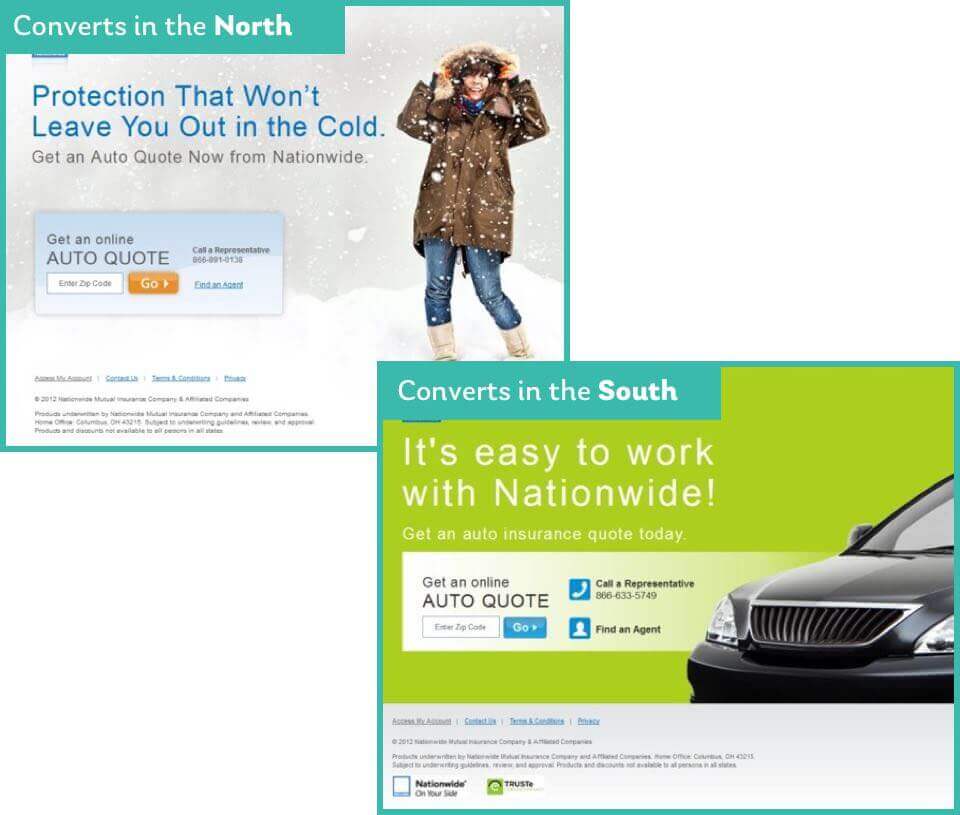
Audience targeting
One size rarely fits all. Showing different versions of your landing pages to different audiences is a great way to improve conversion rates. It can help make your message much clearer, more personal and more relevant to that specific person.
For example, a user’s needs or interests might vary depending on…
- Their geographical location.
- Their age or interests.
- How they arrived at the landing page. (i.e. did they come from a specific advertising source?)
Just keep testing!
Although best practices are important, all sites are different. What works well for one site might not work for yours.
Because the landing page success metrics (conversion and bounce rates) are so easy to measure using tools like Google Analytics, they’re prime candidates for testing and optimisation. Just make sure you’re focusing on both qualitative and quantitative factors in your measurements. Nobody wants to fall victim to The Cobra Effect.
There are some great and affordable services available to help with landing page optimisation :
- Visual website optimizer. Allows you to quickly set up AB testing, which can also be used for audience targeting.
- Usabilityhub’s five second test. Puts the ‘five second rule’ to the test, literally. A great way of getting some fast, genuine user feedback.
- Heatmapping tools like HotJar, CrazyEgg or Mouseflow. These heat-mapping tools will show you what people are interacting with and where user attention goes on your landing pages.
- Google’s PagesSpeed insights. Page load time is such a massive factor, this deserves a shout-out. This tool from Google will give you suggestions to make your landing page load faster.
With so many resources available, there’s no excuse for not optimising. Get testing, and you’ll see the benefits in no time!

Chris Myhill
— Co-Founder