Blog Designing for the edge cases
A common mistake is to only plan for the perfect scenario. Great designs prepare for the unexpected, as well as the ideal.
If our work in digital design has taught us anything, it’s that people rarely use our products the way we expect.
Usability issues are most likely to happen when the unexpected occurs.
When edge cases pop up, it’s make-or-break time for your website or app’s design. If you haven’t planned how the interface will deal with unusual scenarios, the whole experience can quickly fall down.
A mistake we see made time and again is designers only planning for the best possible scenario. After all, the ‘ideal world’ versions of your layouts are the ones used in presentations to clients. They’re the ones that stakeholders look at most carefully. They are the ones you’ll be putting in your personal design portfolio.
In reality, designing for the less-than-ideal situations is equally important.
Why plan for the unexpected?
Let’s say you’ve sent some approved designs to a developer. That developer might find possible usage scenarios that haven’t been thought about in your work. Examples might include how error messages might show up in a form, or a ‘search results not found’ screen.
If the developer doesn’t have designs for these states, they’ll be forced to make assumptions about how the interface should behave. They won’t necessarily have the time or the knowledge to come up with the best possible solution by themselves. Oversights like these allow for usability issues to happen.
In this article, we’ll share some edge case scenarios you might have to deal with, and how you can plan for them in your designs.
Error states
Whenever some kind of user input takes place, there will usually be the possibility for an error. Think about checkout or registration forms. These are minefields for potential user error.
Even if we try our best to make things intuitive, it’s hard to totally remove the possibility of mistakes happening, and these need to be planned for during the design phase.
There are many different kinds of errors for us to think about.
- Validation. The user didn’t enter information in the way the system expected it.
- Submission. There was a problem that wasn’t the user’s fault, but we need to let them know.
- Content. The user requested something we can’t give them.
When designing your product, you need to think about every scenario in which an error could occur. You should then design a state for it, to ensure the system is handling that error gracefully.
This can be time consuming, but it’s the attention to detail that makes for a well designed product.
There are a few different things to think about here…
- How the error appears. We should use animation or contrast to draw the user’s attention.
- Styling and position. The error notification should be visually linked to where the problem took place.
- Language. Errors should be written in a clear, user-friendly and on-brand way. Avoid ‘tech speak’ at all costs.
- Clear solutions. After informing the user of an error, we should also allude to a solution. This might be an instruction, or a link to something else that might help them out.
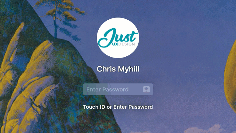
The login screen for Mac OS handles incorrect passwords really nicely.
After entering an incorrect password, the field does a little shake from side-to-side (like someone shaking their head). This draws the user’s attention to the problem, without being obtrusive.
The field also indicates when caps-lock is turned on, addressing another common issue where people may not realise what went wrong.
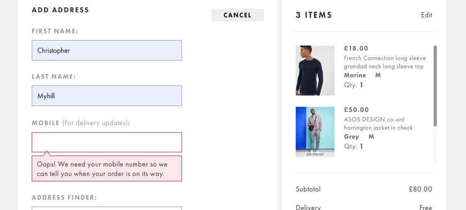
Asos work really hard to refine and optimise their checkout form. Error messages display in-line as soon as a mistake is made, in a really obvious way. The messages themselves are meticulously tested and worded, so it is crystal clear what has gone wrong.
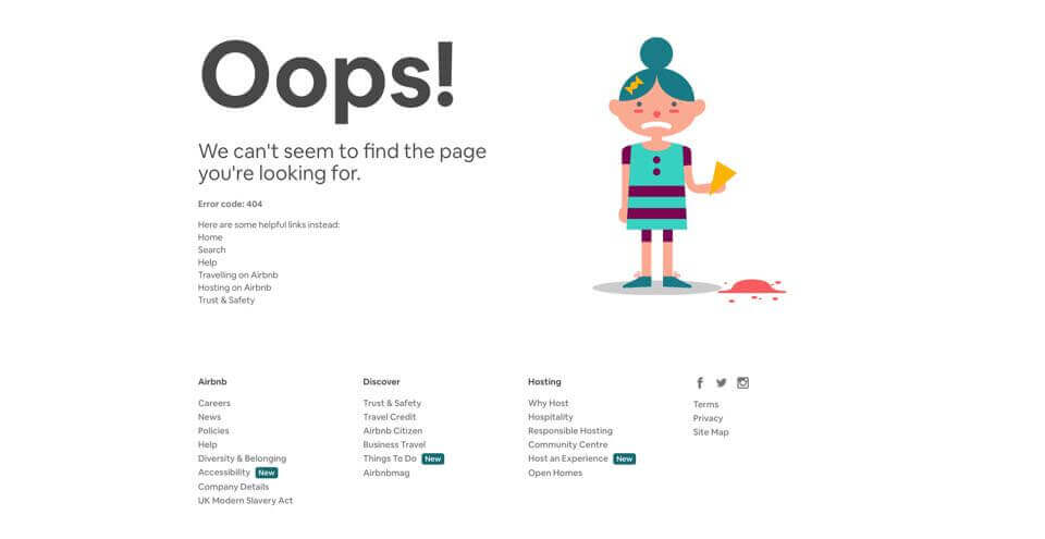
404s are an error that can happen on almost any website. A 404 occurs if the user is linked to a page that doesn’t exist. AirBnB handles this in a great way. It explains the problem clearly without using any ’tech speak’. It also adds a little humour, which can go a long way to easing the user’s frustration. It then goes on to show some suggested links, so the user isn’t stuck for what to do next.
‘0 results found’
Most content-rich sites will need some kind of search feature. This is especially important for ecommerce, where the user’s ability to find a product can directly affect profits.
Bad ‘0 results found’ pages are one of the most common usability issues we see. Given how common the error is, it can be quite astounding how often they’re not thought about by designers.
If you’re designing a site that has free text search, you really must give consideration to what happens when it doesn’t return any results.
You might want to think about :
- Language & visuals. Explain what went wrong in a clear and helpful way. Once again we need to avoid ‘tech speak’.
- Suggestions. Provide some alternative search terms, or a spell-check. If you can’t do this due to technology restrictions, then just having links to popular searches can be better than nothing.
- Featured content. If you don’t have what the user is looking for, then perhaps you can promote the next best thing instead. Featuring something really interesting or new (even if it’s unrelated to the search) might be enough to prevent the user from leaving.
- Contact information. Give the user a way of reaching you. Perhaps the something they’re looking for needs to be added, or maybe they could speak to someone who can help them?
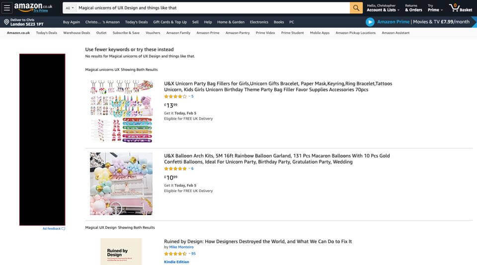
Amazon provides a great example of a ‘0 results found’ page done right. They give suggestions for further searching, in addition to promoting some other related products. If all else fails, there’s also a clear feedback form.
Empty states
It’s possible that certain screens in your site or app that usually show content might have nothing to display at certain times. For example, an app with an activity feed may have nothing to show if the user hasn’t started using it yet. We need to think about how the page looks in this case.
In the absence of content, don’t just show empty space. Instead, the design should make it clear what would normally be shown. We can also use this space to give clear instructions on how to get started.
This doesn’t just apply for apps, either.
if we were designing a site an ‘upcoming events’ section on a website, we’d need to design how it looks if there were no events planned. Rather than just showing an empty space we’d want to tell the user when to expect new events, along with other useful links or information. You might even want them to sign up for notifications for when events do eventually become available.
All of these things can be achieved on the empty state.
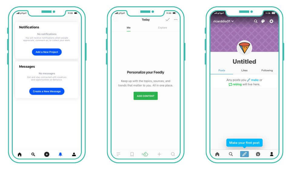
You’ll notice this is a pattern for most well designed apps. Thought goes into what things look like when there isn’t much to show. Like when the user has only just started using the app.
Tutorials & onboarding
Beyond the empty state, giving the user instructions on how to get started can be really helpful.
A tutorial can be a great way to ease people into your app’s features. Using subtle animation or prompts within the normal user interface can get the user started on some key tasks.
The best tutorials are unobtrusive. Rather than showing an overlong video or slideshow of instructions, putting prompts in the context of the experience itself can be really effective. This helps the user learn by doing, rather than having to take in lots of information passively.
Tutorials should only be used if necessary. If your interface is self-explanatory, it might not be needed. Whether or not to include a tutorial is a design consideration you need to make. An alternative is to guide the user straight into their first task, and have them ‘learn by doing’.
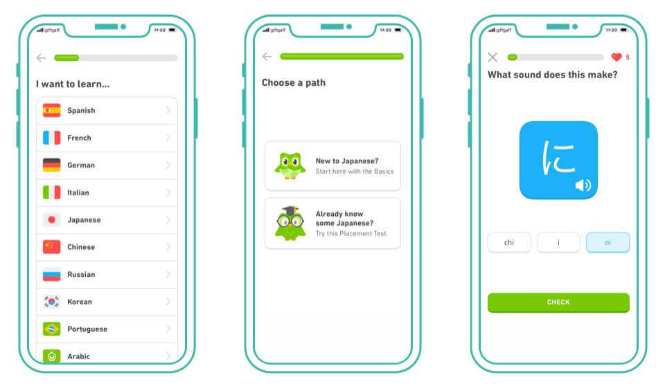
This great example from Duolingo shows how tutorials can be built into the app experience. It helps guide the user through setting up the app, and takes them straight into the process of using it.
Unpredictable content
We tend to create mock-ups with an ‘ideal world’ view of the site’s content. Example copy is usually just the right length. Images are selected perfectly. We go to lengths avoiding ugly line breaks in the text.
But eventually, the reigns of a content management system are handed over to the content creators. Real information is added to the site, and this neatness we planned for in design can no longer be guaranteed.
For example, if we design a page expecting to give the user four different options, what happens if there actually ends up being forty? How does that display? Do we start using pagination? Some sort of lazy-loading?
Planning for this sort of thing now can help prevent issues later.
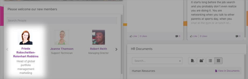
The length of copy can also affect the design in a big way. When using labels or names in your UI, make sure to test with extra long examples. If we’re designing an app that needs to display the user’s name, that needs to work for longer names too. If you’ve only been designing for “James Smith”, will the system cope if “Hubert Blaine Wolfeschlegelsteinhausenbergerdorff” uses it?
The same goes for languages. If there’s any possibility your experience might be translated, you need to make sure the design can support it. We like to use German as a ’test translation’. Words tend to be much longer, and can reveal issues with navigation not having enough space.
Your content experience might need to work in a right-to-left format for some Asian and Arabic markets. The earlier you identify these kinds of challenges, the sooner you can design solutions for them.
Design for every eventuality
Good design is all about attention to detail.
It’s this commitment to designing for every scenario that sets great experiences apart from average ones. Make it your responsibility as a designer to plan for these edge cases. They’ll happen whether you design for them or not, so it’s best to be prepared!

Chris Myhill
— Co-Founder